
Pantonify
Your music taste, translated into color.
A playful exploration of how our favorite music can become something visual, personal, and shareable.
- Role
- Design & Development
- Year
- 2020
- Type
- Creative Experiment
- Tools
- Figma, Next.js, Framer Motion, Spotify API
Beyond the receipt.
Seeing people share their listening habits through Receiptify made me curious about other ways to represent musical identity. Rather than presenting music as a ranked list, I wanted to explore whether something as familiar as color could offer a more expressive interpretation.
How might someone’s music taste become a visual identity worth sharing?
Finding the right visual language.
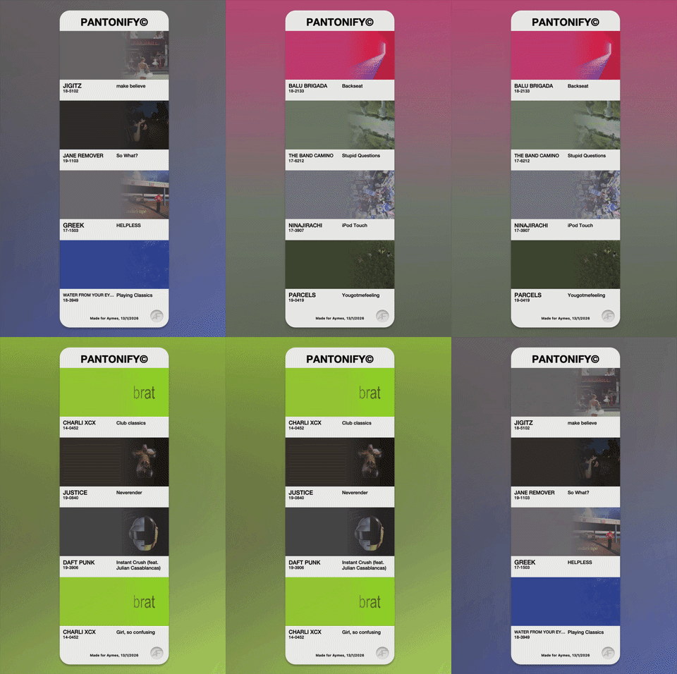
I started from the idea of cards, a familiar and shareable shape. A generic card says little about music, though. Pantone swatches felt recognizable and tangible, and set Pantonify apart from other music-sharing formats.
- 01Cards, to startCard-based representations were my first interest.
- 02Made personalThe format needed to mean something to its owner.
- 03Why PantoneA recognizable, physical reference that no other format used.
From hexadecimal values to Pantone.
Hex values felt like technical information. Pantone references connected the experience to something recognizable from the physical world.
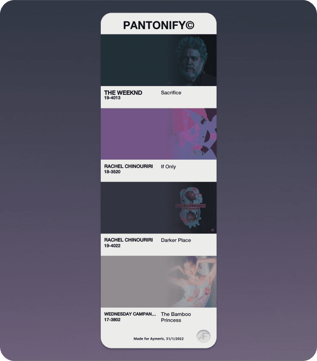
Let color take center stage.
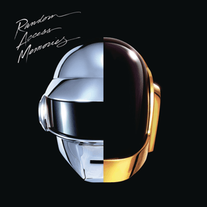
Album covers were retained at approximately 25% opacity, keeping the source recognizable without distracting from its representative color.

Design for effortless sharing.
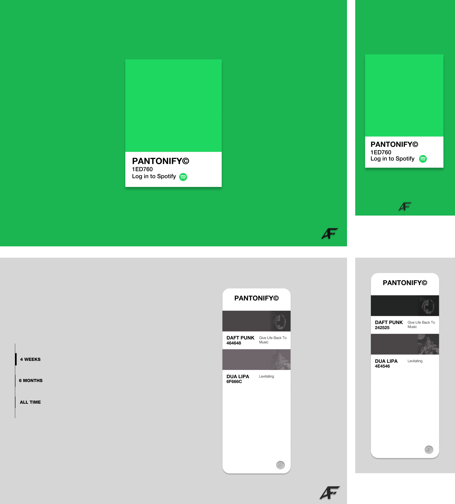
The goal was to make the path from Spotify authentication to a finished card as minimal as possible, on both desktop and mobile.
- Step 01Connect SpotifyStart from a single sign-in.
- Step 02Explore top tracks4 weeks, 6 months or all time.
- Step 03Generate swatchColors matched to Pantone.
- Step 04Export imageSave the card, ready to share.
Small moments of delight.
Pantonify was a chance to explore micro-interactions with Framer Motion.
Making the same visual identity hold up from desktop to phone was a lesson in responsive design, and one of the hardest parts of the build.

From artwork to color.
Built with Next.js, NextAuth, the Spotify Web API, fast-average-color and nearest-pantone. The reasoning mattered more than the plumbing.
- 01Spotify authentication
- { items: [ … ] }02Top tracks
- 03Album artwork
- #2B2F3B04Average color
- 19‑401305Nearest Pantone
- 06Shareable card
A finished creative experiment.
- 01Built and liveDeveloped and made available as a live website.
- 02Fun for friendsFriends tried Pantonify and described it as fun.
- 03True to the visionThe finished experience closely matched my initial creative vision.
- 04Outgrown by the APILater Spotify API restrictions affected the availability of the original experience.
What I learned.
Designing for multiple screens
Responsive design was one of the hardest aspects of the project, teaching me to think beyond a single static layout.
Translating data into emotion
Color offered a way to reinterpret listening data as something expressive, even though a mathematical representation may not always capture the perceived character of an album.
Balancing expression and simplicity
The goal was to build a recognizable visual experience without complicating the path to a shareable result.
Music, translated into color.
A small experiment about turning listening into something you can hold up and share.